Murrumbidgee Council's New Logo Shines Bright
25 January, 2017 - Media Release
Murrumbidgee Council has started the New Year with a fresh new look.
The bright, new logo is the result of several months of consultation with the local community and Council staff.
Murrumbidgee Council Administrator, Austin Evans, said he was delighted with the end result.
The new logo was officially revealed today. The new branding will continue to be rolled out across other elements including signage and stationery in the coming months.
“This new branding marks an important step in building our identity as a new Council,” Mr Evans said.
“It was vital that the communities and staff of the new Council provided input and this was afforded to them through the comprehensive consultation process including grassroots community sessions, staff sessions and the in-depth stakeholder sessions.
“I want to thank all members of the community who participated in the process and provided input for our new logo.
“From the information provided we discovered residents see their towns as strong, community-minded places that are full of potential. They envisage a positive future that is built on the delivery of reliable and innovative services by Council.
“The new logo is a result of this feedback, and is a contemporary design featuring icons that reflect the building blocks of our community.”
The development of a corporate identity for new Councils was mandated by the NSW Government, with Council engaging Riverina-based marketing and design company The Articulate Pear to commence the process in September last year.
The new logo will be used on signage, uniforms, vehicles, email signatures, letterheads, advertising, website, and social media channels such as Facebook.
The unique diamond design incorporates icons to represent a combination of irrigation waterways, nature and agriculture, productive land and growth plus positivity for the future.
The Articulate Pear Director, Sonia Casanova, said the team valued being part of such an important project.
“We are thrilled to present this new corporate branding for Murrumbidgee Council. It is contemporary, distinctive and relevant to the community,” she said.
“It has been an absolute pleasure to get to know the residents of Coleambally, Darlington Point and Jerilderie, and use their insights and aspirations to create this final design.”
MEANING BEHIND THE LOGO
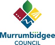
The design and colours chosen represent:

Earthy Red-Ochre tones of the earth and gently influenced by traditional Aboriginal art. Dots signify our three communities, distinct and unique yet side-by-side.

Lush Green- Fresh, new opportunities deliver growth and prosperity to our region.
The leaf shape shows how much we value the natural environment.

Vibrant yellow- With optimism and energy, together we head towards a positive future. Three rows represent the productive land of our expanding agricultural industry.

Deep blue- Waterways and irrigation give life and vitality to our region. The meandering Murrumbidgee River, the Council’s namesake, is clearly recognisable.
A strong colour palette drawing from nature - a combination of gentle cool and positive warm colours- was used in this design.